YEAR 12 COURSEWORK JOURNAL
For my Year 12 Coursework Unit, I decided to investigate movement. Cats have always been my favourite creature and I have always marveled at their flexibility and agility. I therefore focused on this aspect for my project.


This is another sculpture I did using a clay called Craft Crank. Craft Crank is similar to Y Material, except that the colour scheme is extremely limited due to a higher iron content in the clay. Again, this page shows my process of sculpting this cat.


Here is one of the first pages of my ceramic journal. The tiger drawings at the top of the first page were inspired by the Chinese version of Frère Jacques, but the story is about two tigers who are running away and each are missing a limb or facial features. The second on the bottom of the first page is a sculpture depicting the Cat with the Fiddle, one of my childhood favourite rhymes. The second page shows a vessel depicting the rhyme of Jack and Jill, and below, The Five Little Pigs. I decided to solidify my final piece based on Cat with the Fiddle.


Here is one of the pages of my coursework journal. It shows observational drawings of two photos of my cats and three cats I found on the internet. I have used charcoal, HB pencils, colour pencils and fineliner pen. The observational drawings were useful in that they helped me better understand structure and movement of the animal.

This is a continuation of my observational drawings. I used watercolour pencils, acrylic paint and fineliner pens. The grey cat is watercolour pencils. I attempted not to use the colour black when drawing and instead replaced the black with chocolate brown, so the black did not dominant the page. The acrylic painting of the cat below the grey cat shows that acrylic is one of the strongest medias that I work well with. The four cats on the next page, I have combined acrylic and fineliner pen.


These two pages show inspirations from other ceramicists which I have used to adapt into my designs for my final project. I was particularly interested in Edweard Muybridge, and heavily influenced by his stop motion photography.
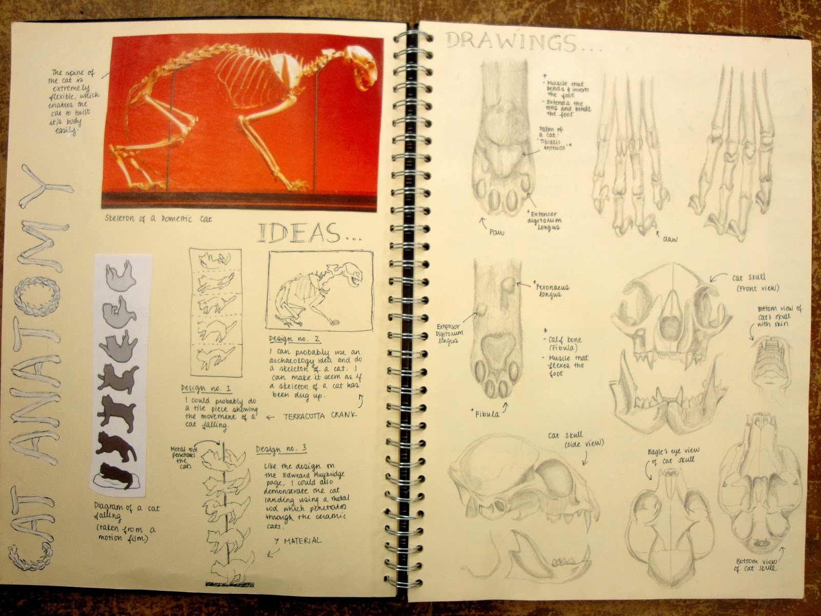
This is one of my favourite and best pages of my coursework journal. The anatomical sketches are all done in HB pencil. Drawing these skeletal parts of the cat has developed my understanding of the cat's flexibility and structure, and it's similarities and differences from a human's skeleton.


These two pages show the first clay work and it's process during Ceramics class. I originally intended to do a cat huddled up, but it was hard to see the limbs. I decided to sculpt my own cat, "Doufu" instead, in the position where he is rolling over. The clay material I used was Y Material. Y Material is a good clay for sculpting as it contains molochite which helps prevent the clay from exploding in the kiln when being fired by reducing thermal shock. A wide range of colours can be applied when it comes to glazing.


During the school term, I went on a school trip to the V&A Museum to gain inspiration from other ceramicists. This is one of my favourite pages of the museum trip. I was able to incorporate the works of the ceramicists and sculptors to come up with ideas related to my theme of cats for my final coursework piece.

This was one of the best ceramic pieces I have done during my coursework. Having had been inspired by the V&A ceramic ware, I decided to respond to a several vessels that I saw and liked at the V&A museum. I slip casted a milk jug out of Porcelain slip. I was really intrigued by the idea of protruding objects from vessels and the idea of cats scrambling into a milk pitcher came up in my mind while I was making this piece. I used Porcelain clay to sculpt the miniature cats. Porcelain is a delicate and fragile material which can distort easily in the kiln due to plastic memory.
This is the milk jug which I cast out of porcelain slip. I sculpted two porcelain cats playfully scrambling into the pitch of the jug, then glazed it using celadon blue. I was inspired by vases with protruding objects from the V&A Museum I visited for a Ceramics trip. I have playfully imagined vivacious and adorable cats trying to scramble into the pitcher to get at whatever liquid that is stored in the jug.

This is another one of my favourite pieces in Ceramics. In response to my little jug, I made a teapot, also slip cast using Porcelain slip and sculpted cats scrambling all over the surface. Making this was pretty challenging as I placed some of my cats directly on the vertical sides of the teapot. There was great potential that they would break off when being fired in the kiln.
This is my final piece for my coursework, the Falling Cats. I was inspired by cinematic photographer, Edweard Muybridge who captured moving objects at different stages. I used Y Material as it is durable when being fired in the kiln, it has molochite to prevent it from cracking and breaking. This was one of the most challenging pieces I have ever done as I managed to sculpt five cats towards the end of the first term. Each cat had to be the exact same size and the hole drilled in each cat had to correspond with it's appropriate rolling position to generate the illusion of falling cat righting itself in midair.
YEAR 12 EXAM UNIT JOURNAL
For the Year 12 exam unit, we were given various themes to choose from, one of the themes was Nursery Rhymes, which I chose.

After deciding to focus on Cat with the Fiddle, I did observational drawings of dogs and cats. I practiced drawing a standing cat as the cat is standing while playing the fiddle. I also drew a laughing dog, which is rolling over and this helped me decide how to position it when making the final piece.
This is my favourite page of my exam journal. I was inspired by the portrayal of animals in my childhood favourite author and watercolour artist, Beatrix Potter, who is well known for her children's books, The Tale of Peter Rabbit. I was thinking of portraying my cat using her depiction of one of my favourite characters, Tom Kitten. On the next page of Beatrix Potter, I have done watercolour responses to her characters, Tom Kitten and his sister, Moppet. Watercolour has always been my strongest media.

Here is a page of ideas of how I want to display my final piece. I chose the ring design where I would sculpt miniature figures of the characters in the rhyme in each ring.

This the final product of my exam unit. I managed to finish all my figures within the five hours of the exam. During the limited exam period of five hours, it was necessary to work quickly and I would have liked to refine the piece to a greater degree, although I feel the final piece fulfilled my project's conclusion.


YEAR 13 COURSEWORK JOURNAL
For my Year 13 Coursework Unit, I decided to investigate movement within change in shape and form. This is in response to my Year 12 Coursework Unit, which was movement involving Cats, based on their agility and flexibility. I solidified my decision in challenging myself to use the aspect of Metamorphosis within my Ceramic coursework.
Here is one of the pages of my coursework journal. It shows observational drawings of mammals and amphibians which involves Metamorphosis. The most common ones are frogs and butterflies. I have drawn the images from photos from the internet. The media that I have used are graphite pencils, watercolour pencils, fineliner pen and colour pastel pencils. I have improved on my fineliner drawings and I am more confident now with colour combination.
These are further studies into the theme of Metamorphosis. I decided to investigate fantasy stories involving characters changing shape and form. I found the Ugly Duckling, who starts off as a cygnet who grows into a beautiful swan, The Wild Swans, where twelve princes are cursed to turn into swans by day, and humans by night, The Hungry Caterpillar, where the caterpillar changes into a butterfly after eating so many food, and Disney's Fantasia 2000, a spring sprite who is like a blanket of water creating spring.
I also studied Greek myths involving Metamorphosis, mainly the stories from Ovid's Metamorphoses. The stories I looked into were Daphne & Apollo, where a forest nymph named Daphne is transformed into a laurel tree to escape from Apollo, Echo & Narcissus, a forest nymph who was cursed to repeat the last words and became the air due to an unrequited love from a vain shepherd named Narcissus, and Arachne, a boastful weaver who was turned into a spider by the goddess Athena. I also took an interest in a figure sculptor named Claire Curneen for the way she elongates and distorts her figures. I also used the Ovid's Metamorphoses stories to create designs in respondent to Curneen.
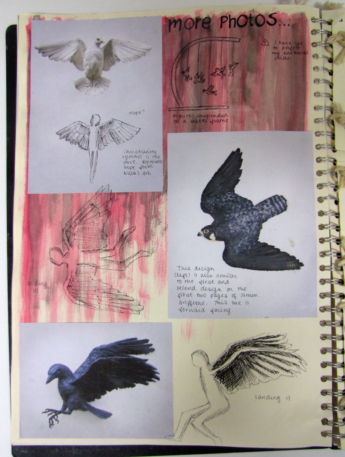
Here is another sculptor which I also investigated called Simon Griffiths, who is well known for his bird sculptures. His work reminded me of The Wild Swans story, and also made me think of another Greek myth, Icarus & Dadelus, where an inventor named Dadelus crafted wings constructed of birds feathers stuck together with wax for himself and his son, Icarus to escape an evil King. Icarus flew too close to the sun causing his wings to deteriorate and plummets to his death into the sea. The inserted page contains ideas inspired by the story of Icarus & Dadelus, symbolizing 'death'.
I decided to work on human figures for my Metamorphosis theme. The first page shows sketches of a huddled bronze figure I sketched using graphite pencils and the idea of having wings sprouting from the back. The next page shows skeletal sketches of the human body, and my idea of replacing the arms with wings. In the inserted pages, is about another human sculptor named Rodin. I have studied Rodin in History of Art and used that knowledge to influence elements of my sculpture, especially when sculpting the torsos. The crouching figure gave me the idea of humans with wings hatching out of eggs symbolizing 'birth'.
These pages show the process of a swan vessel I made within this coursework assignment. I used a type of clay called White Stoneware. White stoneware is stronger than earthenware, when fired to high temperatures and has
wide range of firing and glaze colours. I was inspired by The Ugly Duckling story, as I was focused on how a cygnet changes in colour, shape and form as it grows into a swan.
This is my completed swan vessel, in response to a Japanese ceramicist named Keiko Masumoto, who was a Ceramic Resident at the V&A Museum. The vessel has not been glazed yet as I am still debating on how to colour the swan. I am pleased with the outcome so far as the wings and the neck did not break when it was fired in the kiln.
This year, I went on a Ceramics Trip to the Horniman Museum to gain inspiration for our coursework. The Horniman Museum displayed stuffed animals, their skeletons and some that were dissected. I was particularly fascinated by the stuffed birds on display and their skeletal structure. This is one of my favourite pages from the trip. I really enjoyed painting the wings of the stuffed pigeons. I combined watercolour and acrylic to create the patterns on the wings.
This is my planning for the final outcome of this coursework unit. I have decided to create winged figures, having had been inspired by The Wild Swans story and the Greek mythology of Icarus & Dadelus. I wanted to work with the aspects of the life cycle from birth to death. I find it dramatic and expressive thinking of winged human figures hatching, rising and falling. My sculpture represents this swift transition through life, the wings emphasizing this quick and rapid passage.
These pages show the process of my final outcome. I made three winged figures with Y Material as the clay is durable when being fired in the kiln. I combined the techniques of the human sculptors, Rodin and Curneen when making the human figures. The structure of the body is proportioned based on Rodin's techniques, while the legs, head and facial features are modeled after Curneen's. The wings are sculpted in the style of Simon Griffith's birds. I originally intended to place my figures in eggs made of Porcelain slip, but changed my mind when I decided to represent the life cycle with my figures. I have finished my figures and am in the process of creating an agateware base to display them on.
This is the first figure of my final coursework. He is in a huddled position with his back about to curl up. This is 'birth'. I originally intended to display him in a cracked egg to emphasize the idea of 'birth', but decided to scatter the bits of egg shell around him instead, as the egg broke easily.
This is the third figure of my final coursework. He is sprawled on his back with his wings levitating slightly off the ground. This is 'death'. This is in response to Icarus, who ruined his wings by flying too close to the sun, thus causing him to plummet to his death in the sea. The ends of the wings have been slightly separated to emphasize the fact that he has fallen and died. Before having them fired, I placed the figure on a kiln shelf to prevent it from moving or breaking when being lifted into the kiln.
This is the second figure of my final coursework. He rising with his wings spread out. This is 'life'. I also wanted to display him rising out of an egg to emphasize the beginning of life, but changed my mind. The figure was particularly challenging as the wings were quite fragile, despite being a strong material. The ends of the wings are also separated to give movement when being suspended. Before adding the wings, I had to place my figure on two kiln boards, in a cross shape, so the wings could be supported and to prevent it from breaking when being placed in the kiln.


